Personalized Collage Portrait
- Jason Fujiwara
- Mar 22, 2021
- 6 min read
Recently, I’ve been fortunate enough to have been asked to make a personalized collage portrait of an old friend from high school, who unfortunately passed away a few years ago. I always wondered what Steven was up to and how he was going after high school and was a bit of a shock to hear of his passing. I think one of the best experiences we shared was when we went to Japan as part of an exchange program. He never got the chance to come back (and I’m now living here), so I like to think that in a way he has actually returned to Japan, and will soon be back home in Australia with his family.
As mentioned above, this collage is a portrait of my friend. I started out gathering some basic information about him, such as his favourite colour, hobbies and interests, and a bunch of his pictures that I would later use as reference photos for the collage.
Armed with his personal information and photographs, I went ahead a made a few very rough digital designs. This was mainly for me to get an idea of the actual size, proportion, and layout of the portrait.
Steve was quite outgoing and loved the opportunity to dress up in his favourite costume. In the first picture on the left, he was dressed up for an archery contest and was the winner; the middle is the aftermath of a Magic the Gathering card game tournament. Here, he's sitting on the throne like a bad-ass because he also won that tournament. Lastly, is a picture from his 16th birthday. From memory, there was a bunch of us who stayed over at his house, playing games, watching movies, eating food, and chatting. His big, curly, voluptuous head of hair was also something I vividly remember. In the end, we decided on this portrait to be the final collage.
His favourite colour was pink, so I went with a pink theme throughout the collage. He also liked various manga and anime, so I would incorporate that imagery into the collage, which I'll go into more detail later.
I figured that collaging smaller sections together first, and then later placing them together to make the full portrait would be the easiest way of creating this portrait. It would also leave room for any mistakes I made.

I started making the face first, using dark red/ burgundy, bright pink, and light pink as the main colours and a bunch of other colours for highlights and details.
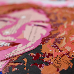
The burgundy colour was pasted onto a white background. The white would later be cut out. Burgundy was the largest shape that I cut out for the face and would act as the shadows and make Steven's face appear more three-dimensional. On top of this, I glued the bright pink, which would act as a mid-tone. The bright pink was basically the same shape as the dark red colour, except that I cut out the areas that I wanted the dark red to show through in his face. Lastly, I cut out a light pink, which would act as a highlight and add a little bit more detail to his facial features. Similar to the previous pink layer, I cut away areas of the light pink where I wanted the brighter pink to show up.
After the bulk of his face had been completed, I went in and filled out his eyes, mouth, and other details with white and other colours.
The next challenge was his enormous, curvaceous hair! I had a few ideas of how I could make his hair:
1) I could make his hair in a similar style to how I did his face. This would be the most complicated and intricate method and take the most amount of time.
2) I could have torn the paper to try and replicate the scruffiness of his hair.
3) Some combination of both.
I thought option 2 would have worked really well, but the more I looked into it and started experimenting with torn paper, the more I didn't think it would work. So I went with option 1 because I knew I could get a good-looking head of hair with that technique, even though I knew it would take the longest amount of time to complete.
For the face, I started with the darkest colour and then each layer after, gradually getting lighter. I wanted to do the same for the hair, however, I didn't have enough of some of the coloured paper to make large enough cut-outs of each layer.

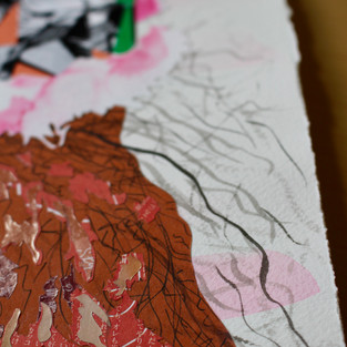
So what I did was to make the brown colour the main backboard where I would paste the other coloured papers. The other colours would simply be blocks of colour to make shapes of his hair and would be the shadows (dark red and black) and highlights (red and light orangey/brown). I traced the outlines of his hair on the brown backboard as a guideline for where I needed to place the hair-shapes. I also drew/ scribbled in areas that I knew wouldn't be collaged so that I could mimic Steven's scruffy hair before I started pasting the rest of his hair.
Now, it was time to start cutting and pasting! I started cutting out the darker colours first - dark red, then black. Dark red was glued onto the brown backboard, followed by black pasted onto the dark red, creating the darker and shaded areas of the hair. A similar process happened for the lighter red and orange layers, creating the highlights of Steve's hair.
For your viewing pleasure, here's a little movie of the whole process described above.
Thankfully this was the majority of the collage completed! The rest of the portrait wouldn't be as complicated or as time-consuming. I only had to finish his birthday hat and the frilly edge, and his t-shirt.
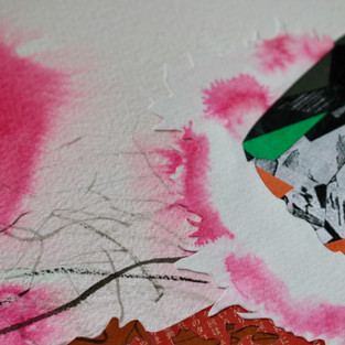
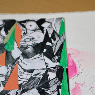
Some of Steven's favourite anime and manga was Neon Genesis Evangelion and Deathnote, both of which I incorporated when I made the birthday hat. I cut up some Neon Genesis Evangelion and Deathnote manga into random shapes and collaged them to make the shape of his birthday hat. The imagery is a bit morbid, so I tried to lighten the mood by adding some brighter colours. The frill on the hat and the t-shirt I made by painting ink on white paper and then cutting out the shapes.
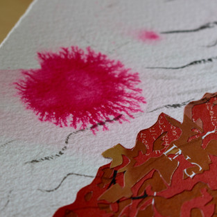
After all of these were finished, it was time to put everything together to create the completed portrait. I placed everything on 30 x 30cm Arches handmade paper. But before I did any of that, I painted the background pink, but not a solid pink. I loosely painted with a very light pink wash first. Then over the top, while it was still wet, I sprinkled some blobs of more solid pink. This would create a really beautiful bleed effect to appear across the surface.
Once that had dried, I firstly pasted down the hair then followed by Steve's face on top. I let it dry and placed it flat with something heavy and on top. I repeated with the other parts of the portrait until I was completed with the finished portrait of Steven.

For the finishing touches, I painted strands of hair using black ink. Some strokes were darker or lighter, thicker or thinner, others were longer or shorter strokes. I like how precise and exact collaging can be, but I also enjoy adding random or unprecise elements to complement the overall appearance.
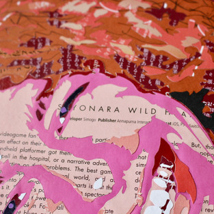
In total, the whole process took about 30 hours to complete. I particularly like how in the light pink layer in Steve's face, the text says "sayonara wild hearts", which was completely coincidental.
I'd like to thank Steven's family for allowing me to do this portrait in his memory. I think as an artist, it's a dream to be able to do work that is as meaningful and as important as this portrait is to his family. I'm proud that I had a small part in how Steve will be remembered.
If you would like a personalised collage portrait of a loved one, it would be a privilege to help in some way.
Prices starting at AUD $400/ JPY ¥33,000 for 30cm x 30cm. Prices may vary, depending on shipping.
If you enjoyed this post, please consider sharing it on Facebook, or wherever you share cool things. And as always, thank you for reading!
P.S. I’d love to meet you on IG, say hello: here






Comments